My Work
I started working with this client right from the start of her business. She was just figuring things out and came to me with some questions. As time went by, my role became bigger within the Company.
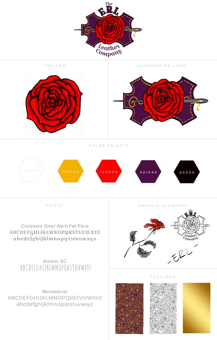
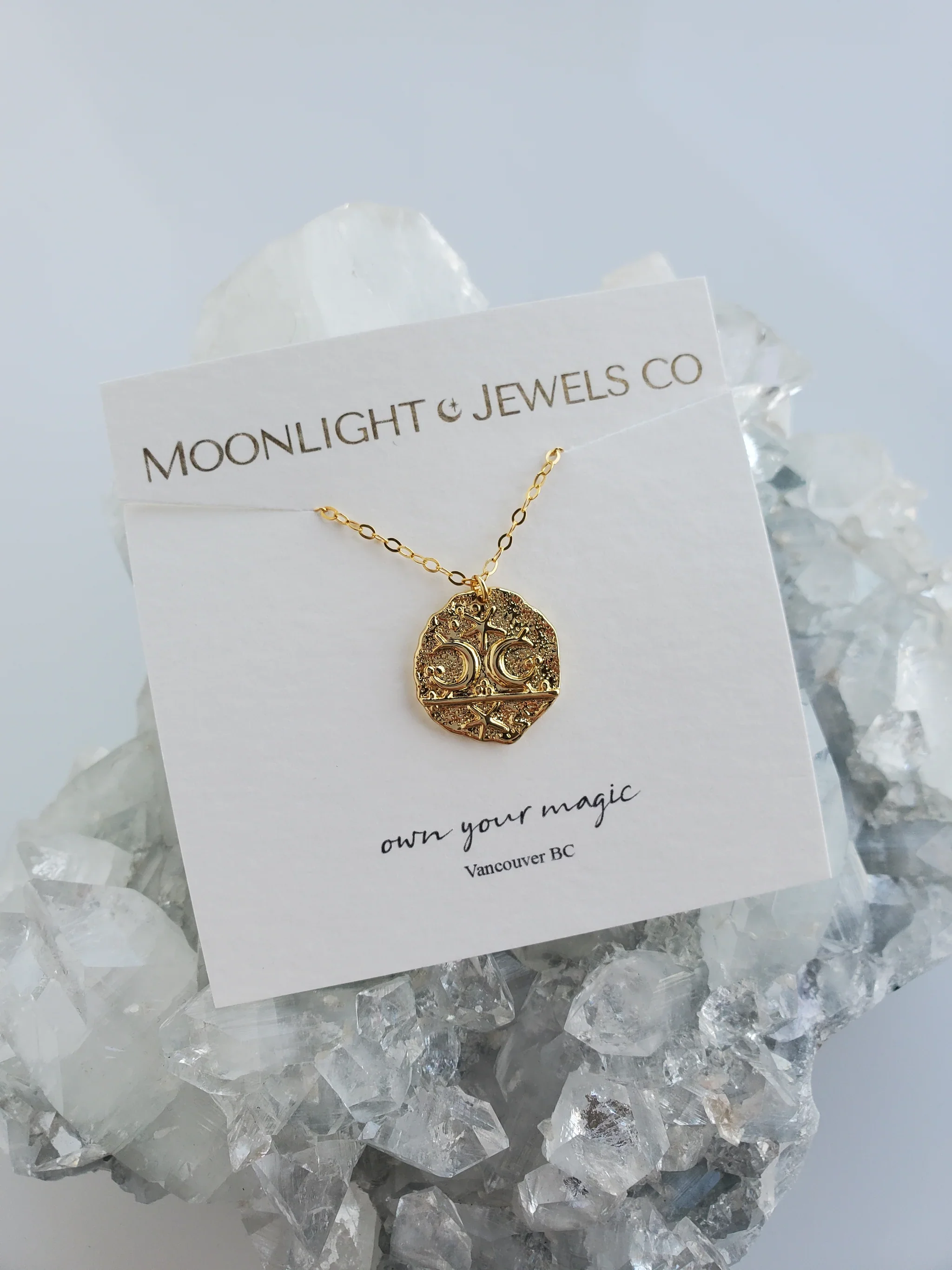
The client being very artistic, had drawn her own logo, but needed it vectorized for printing and other branded items/tools.
Knowing that branding isn’t just about the logo, we analyzed what she already had in place to clarify the “natural brand”, and came up with her brand board.
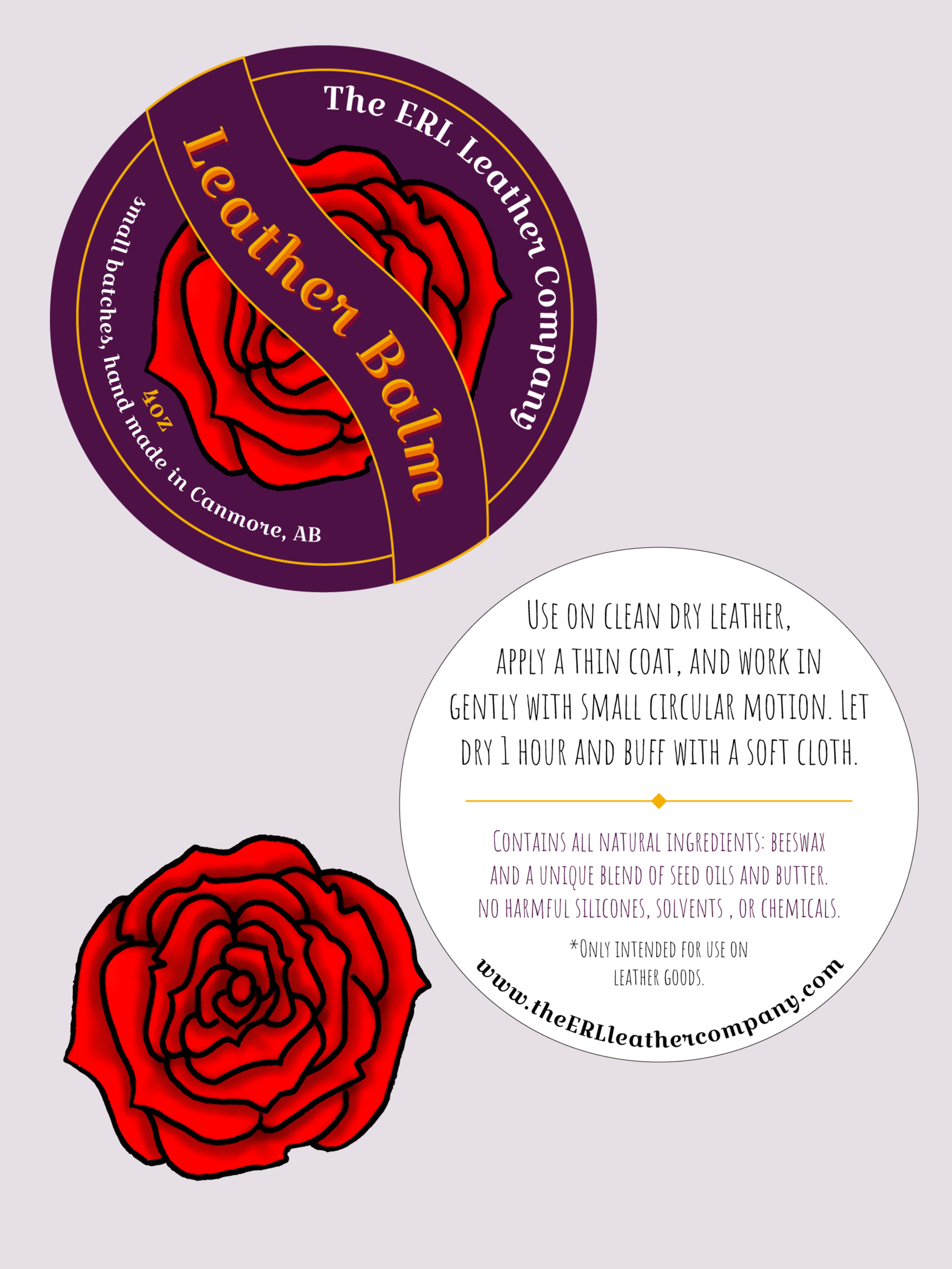
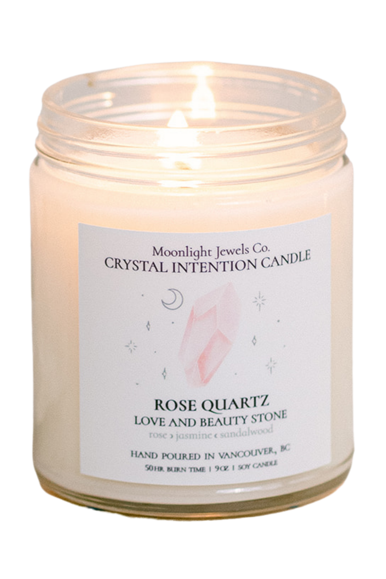
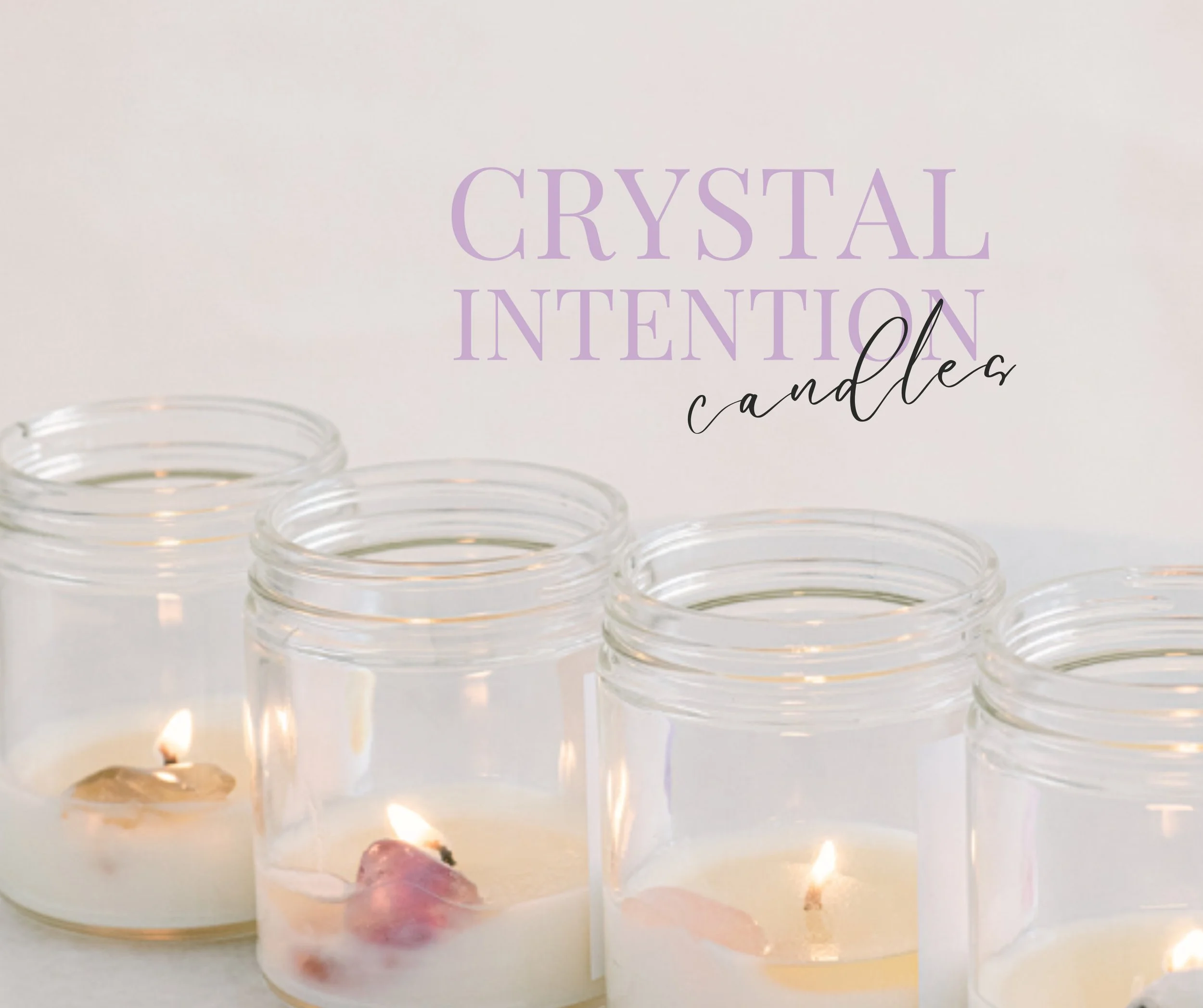
Later on, the owner struggled with creating a label, and needed help.
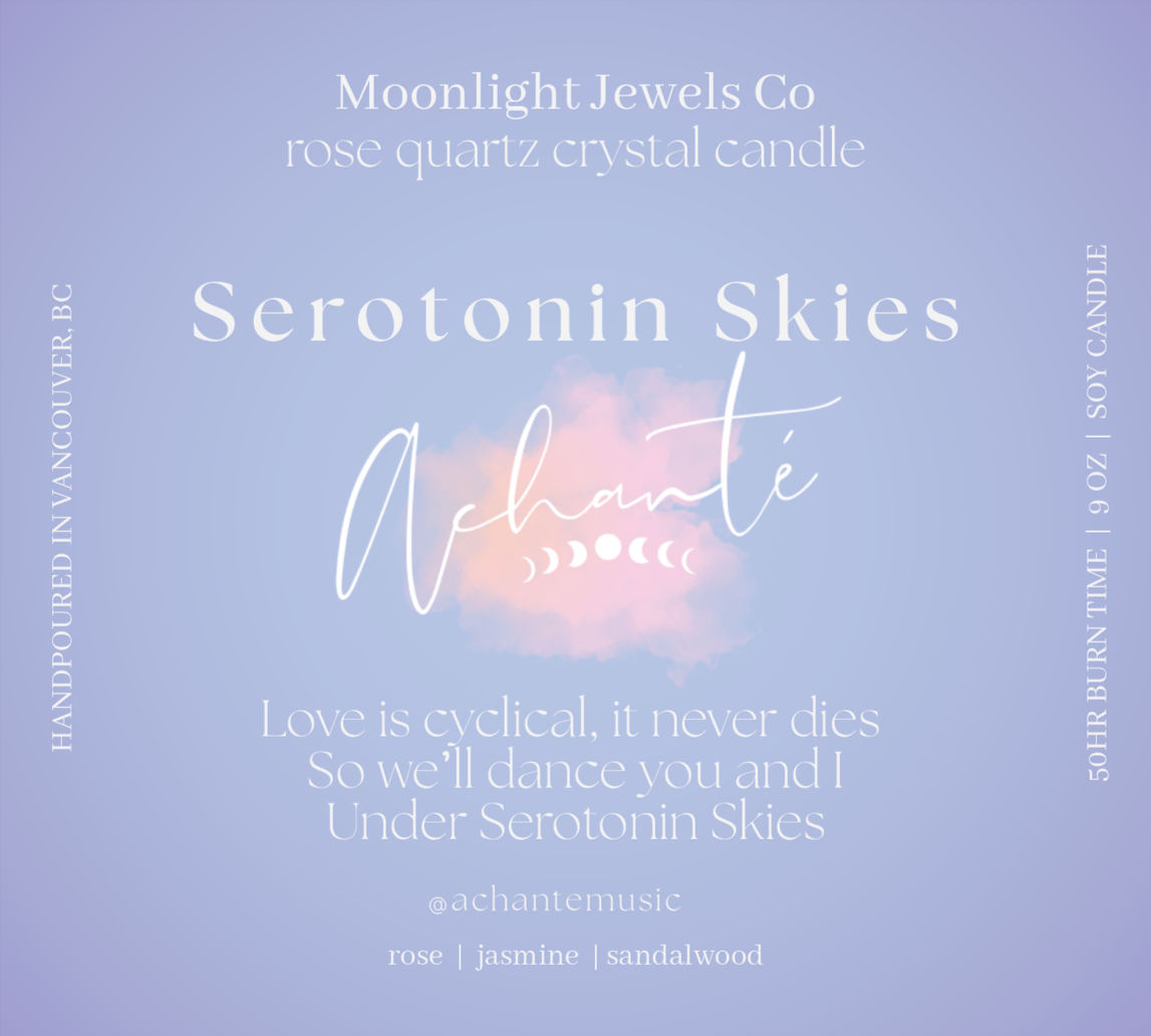
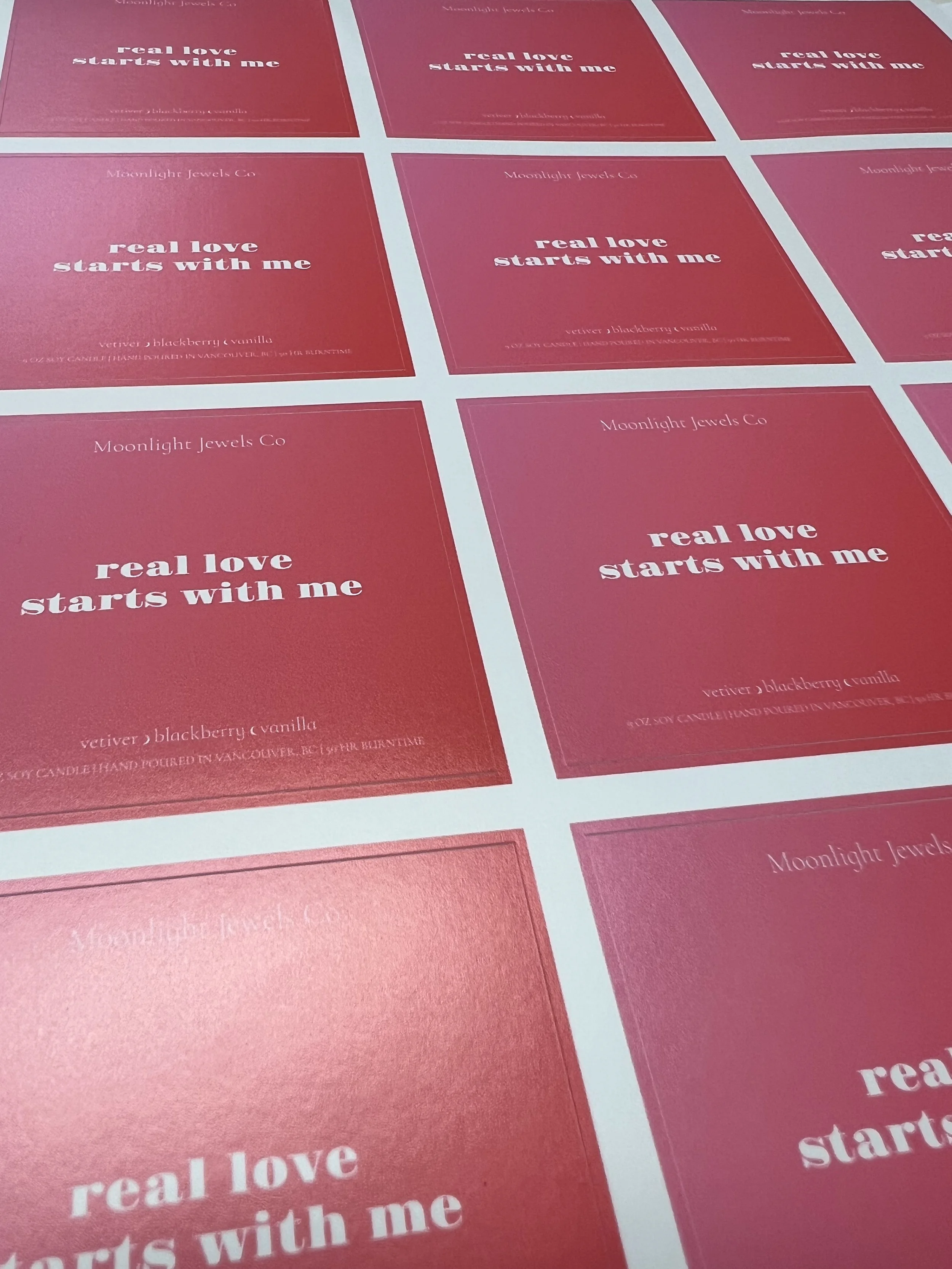
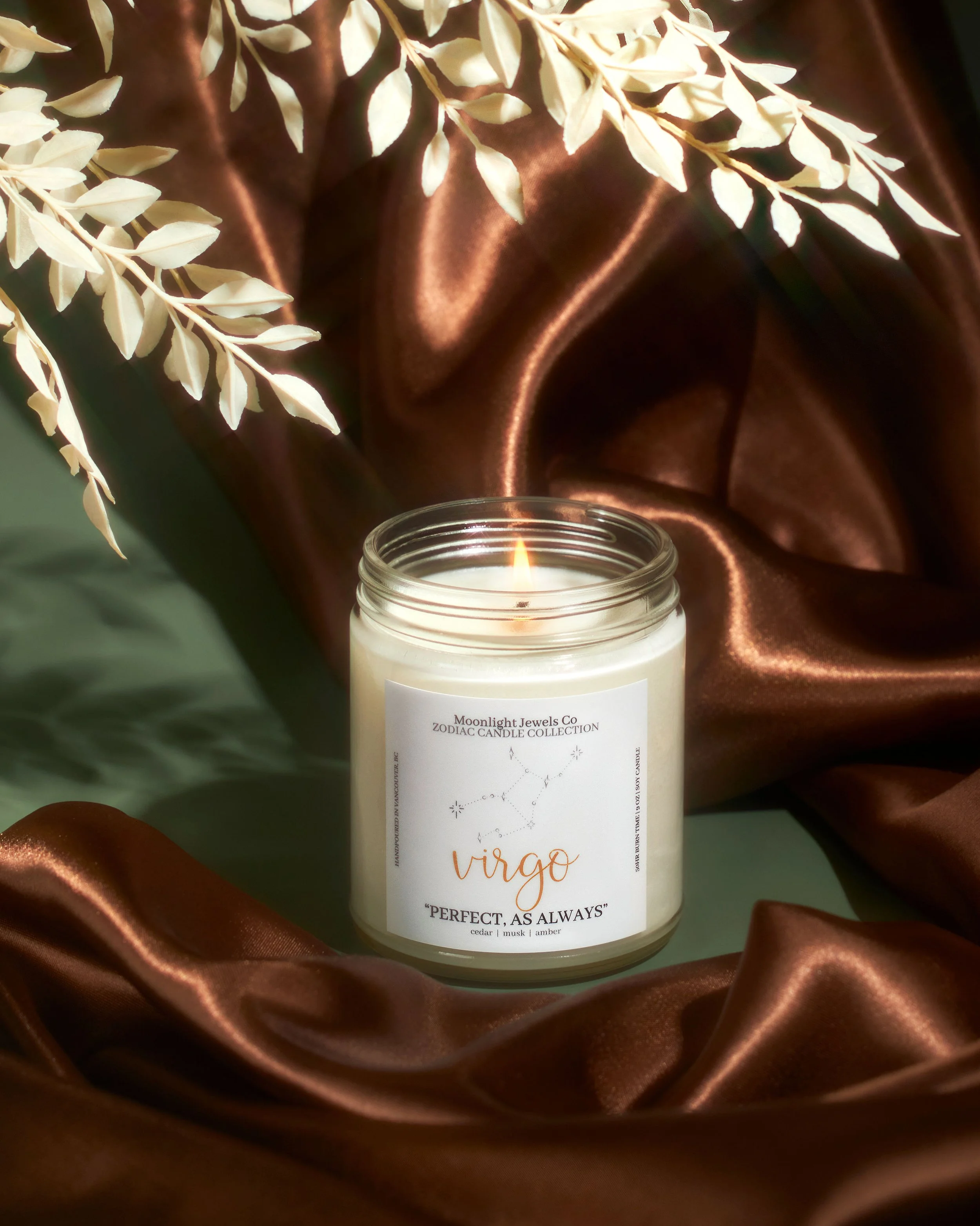
I went to work and made a label for the new product that was easy for the company to order (and reorder) from the printers, at any time. No modifications needed, made according to the printer’s standards and requirements. The client only has to upload the file, choose the options (glossy, mat, etc) they needed, and place their order.
Quick, simple, and no headache trying to figure out all of the technicalities.
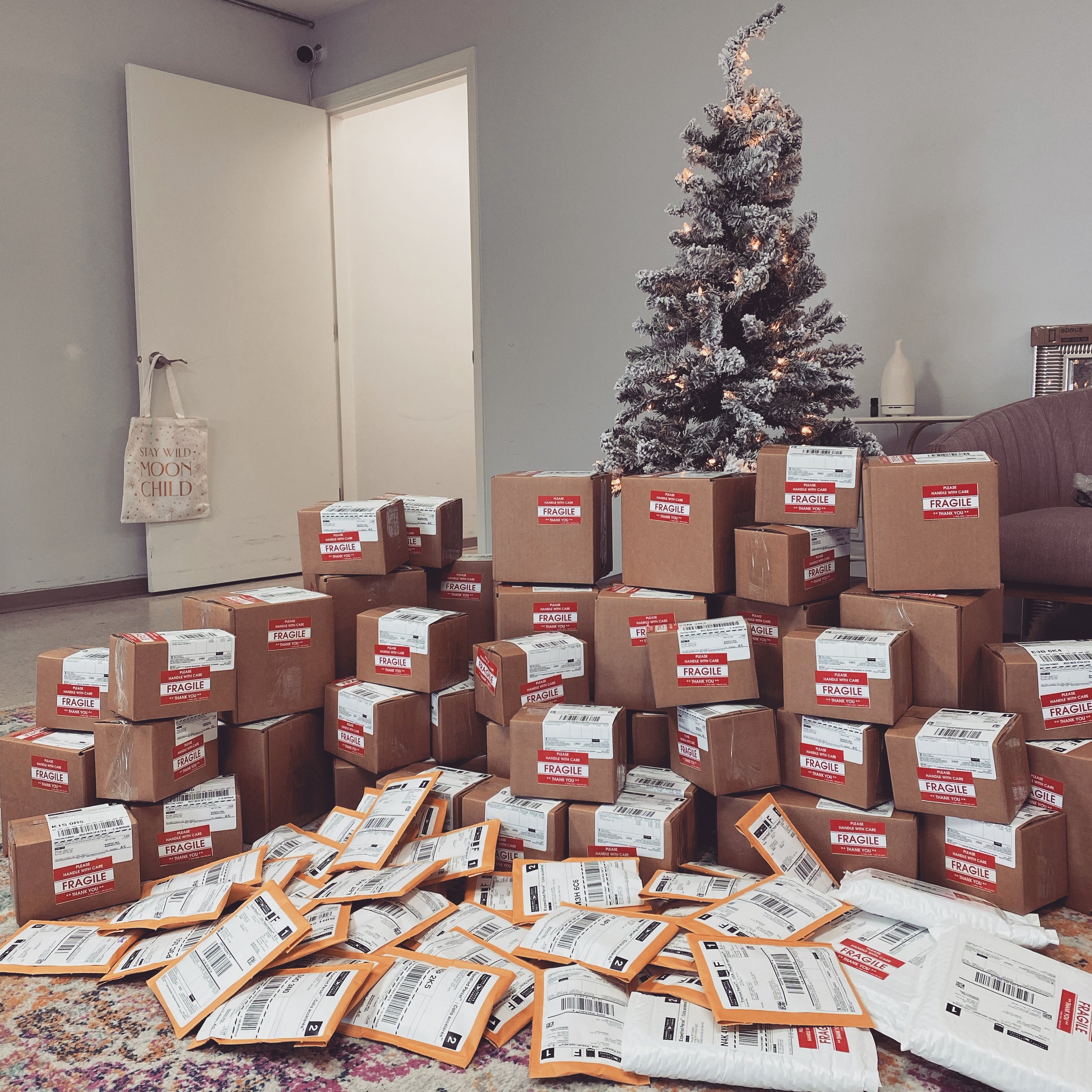
Life got busy; and this business grew quickly. The client even moved to a new and bigger shop, got new fancy tools to improve her production time, travelled to learn new skills… it was really beautiful to see how far she had come in so little time!
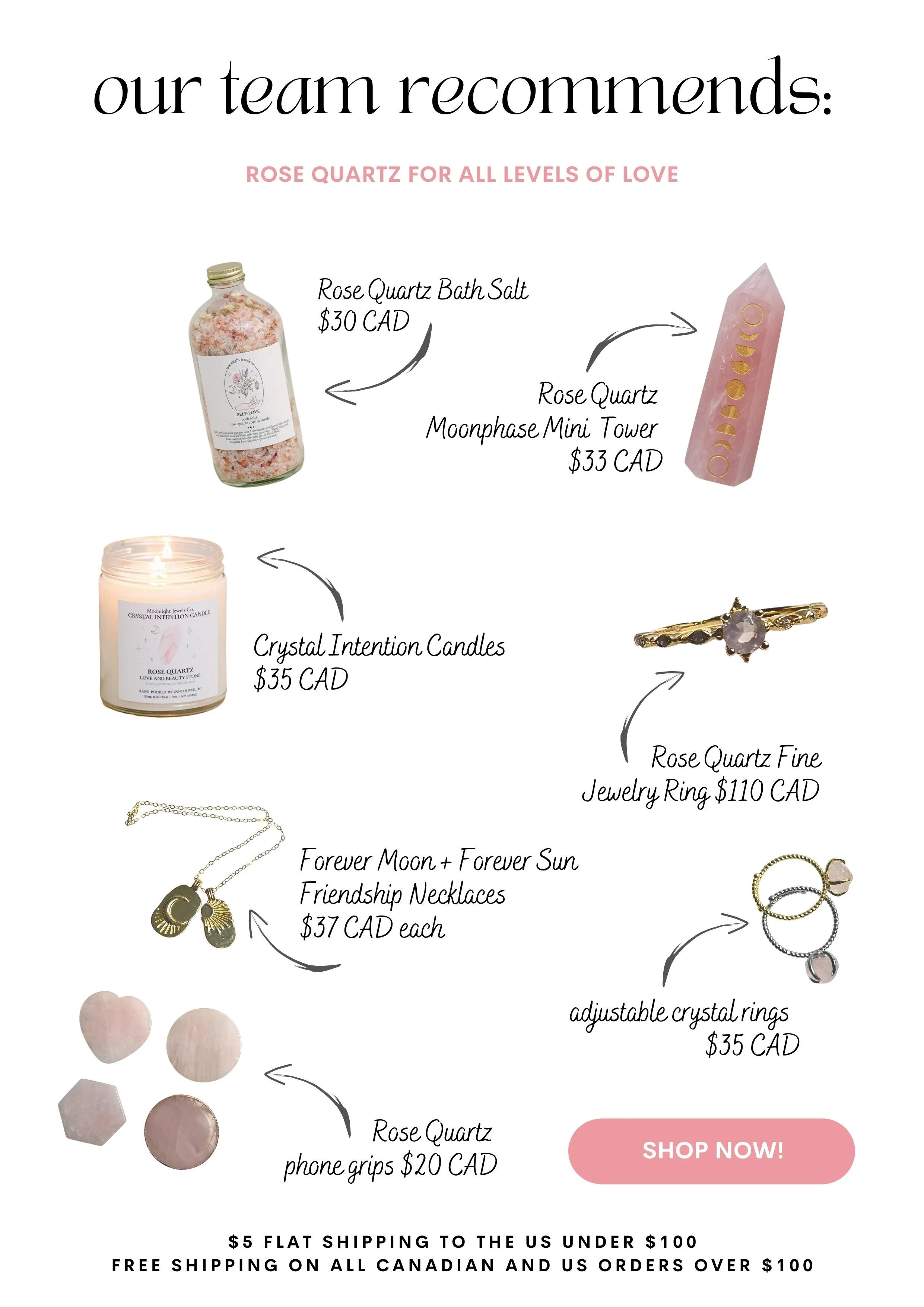
During this time, I also relocated and took on a big client. In Q4 of 2025, the client reached back out. It was time for her to focus on her marketing; emails, social media, blog, strategy, etc.
On the first month back working together, we definitely did some good things.
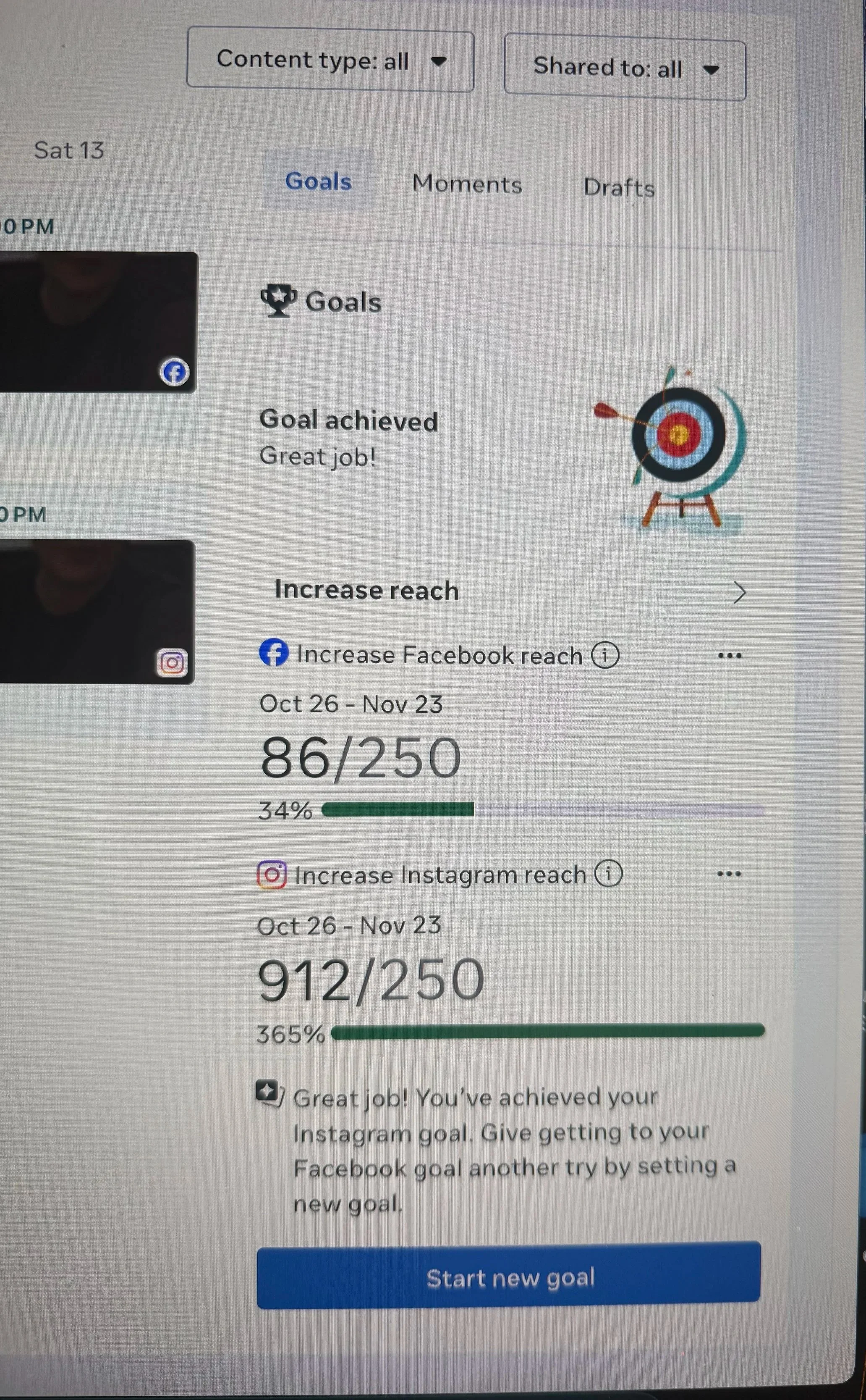
We established goals
We strategized and made sure that what we planned was realistic for the client
We saw our first results on Month #1 (see picture).
We started working on 2026 and aiming our actions in this direction. Knowing very well that Christmas is a high season for all commerce businesses, in order to have the energy and focus to align herself for growth, the client requested slower marketing during Christmas, and keep things minimal this year, so she could enter 2026 with “Big Energy”.
Being a go-getter doesn’t mean it’s ok to normalize burnout. Respect!
This client and I worked together for 2 years building her e-commerce empire.
We were featured in big media outlets and built a social media following of 260k very quickly. We made it to the very exclusive shelves of WholeFoods, Nordstrom Canada, and was also offered to expand further and stroke a deal with Walmart Canada.
With this company, I wore many hats. Working full time, I created labels, packaging, email marketing, website graphics, social media content and strategy, customer relation manager, looked after different departments, like production and quality control, shipping, invoicing, inventory management, human resources… Basically a CMO and COO.
Unfortunately, during Covid, the business ran into supply chain issues and the capacity to produce in large quantities became difficult. For this reason, including the fact that the owner was also going through difficult personal things, the owner decided to take a step back from the business.
We’re still in touch on a regular basis, and I’m sure we will work together again in the future!

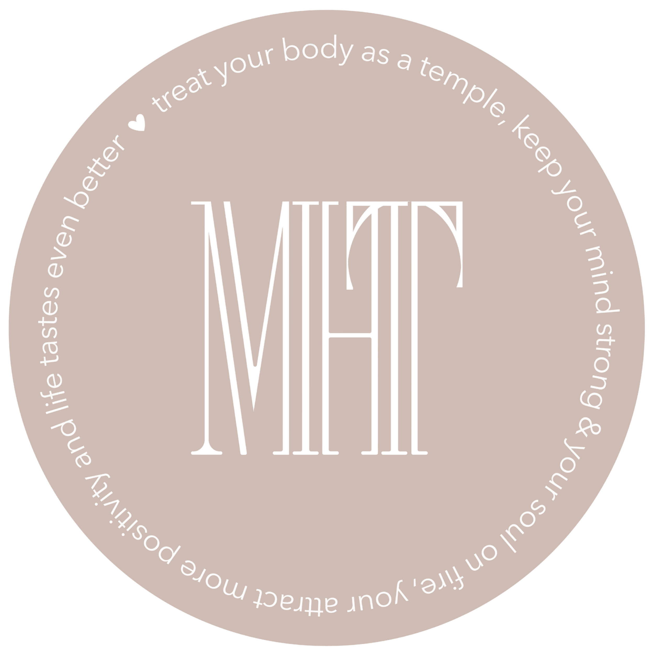
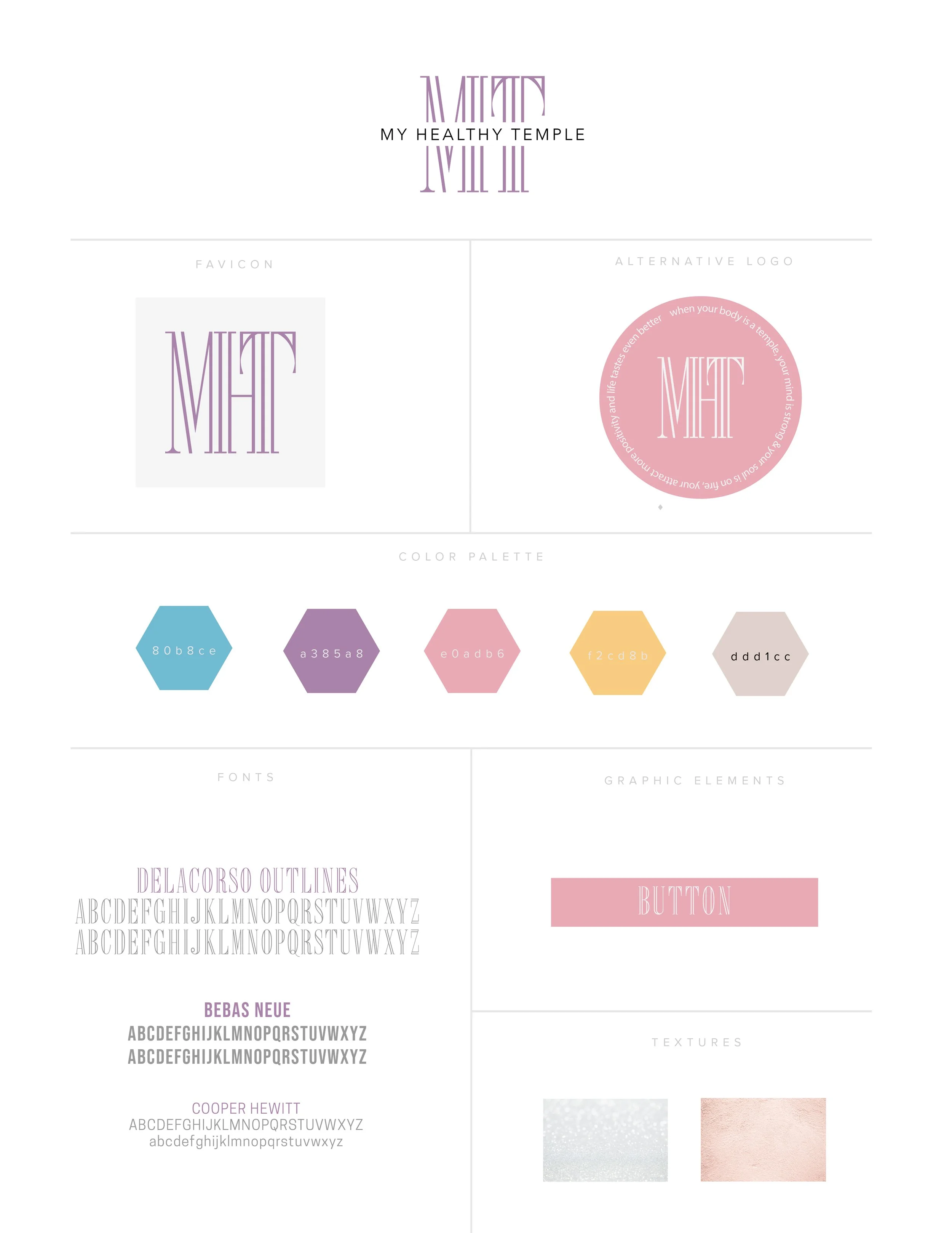
My Healthy Temple
A brand for young women to find better connection to themselves and choose the path of health and self-respect, to become strong, independent, and unstoppable.
This client already had a small but mighty following and wanted to grow towards creating a community of like-minded people.
Wanting to do everything all at once, execution was the hardest part for them.
We since have updated the colour palette since after some market research, we came to the conclusion that their audience was different than the initial consult, and responded more to muted colours.
We are always here for this client and hoping to see great things coming soon from them!
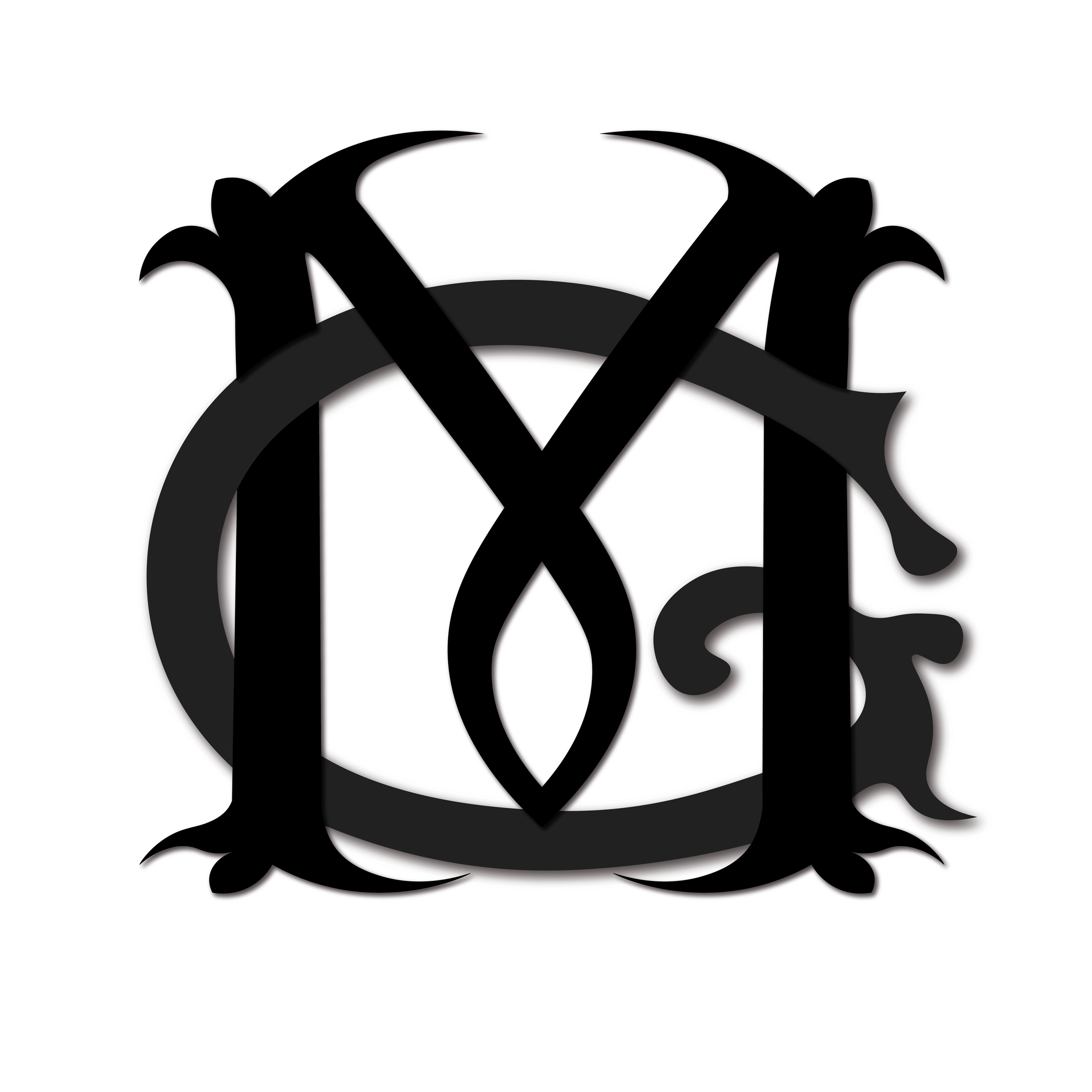
Mike Gray & Sons
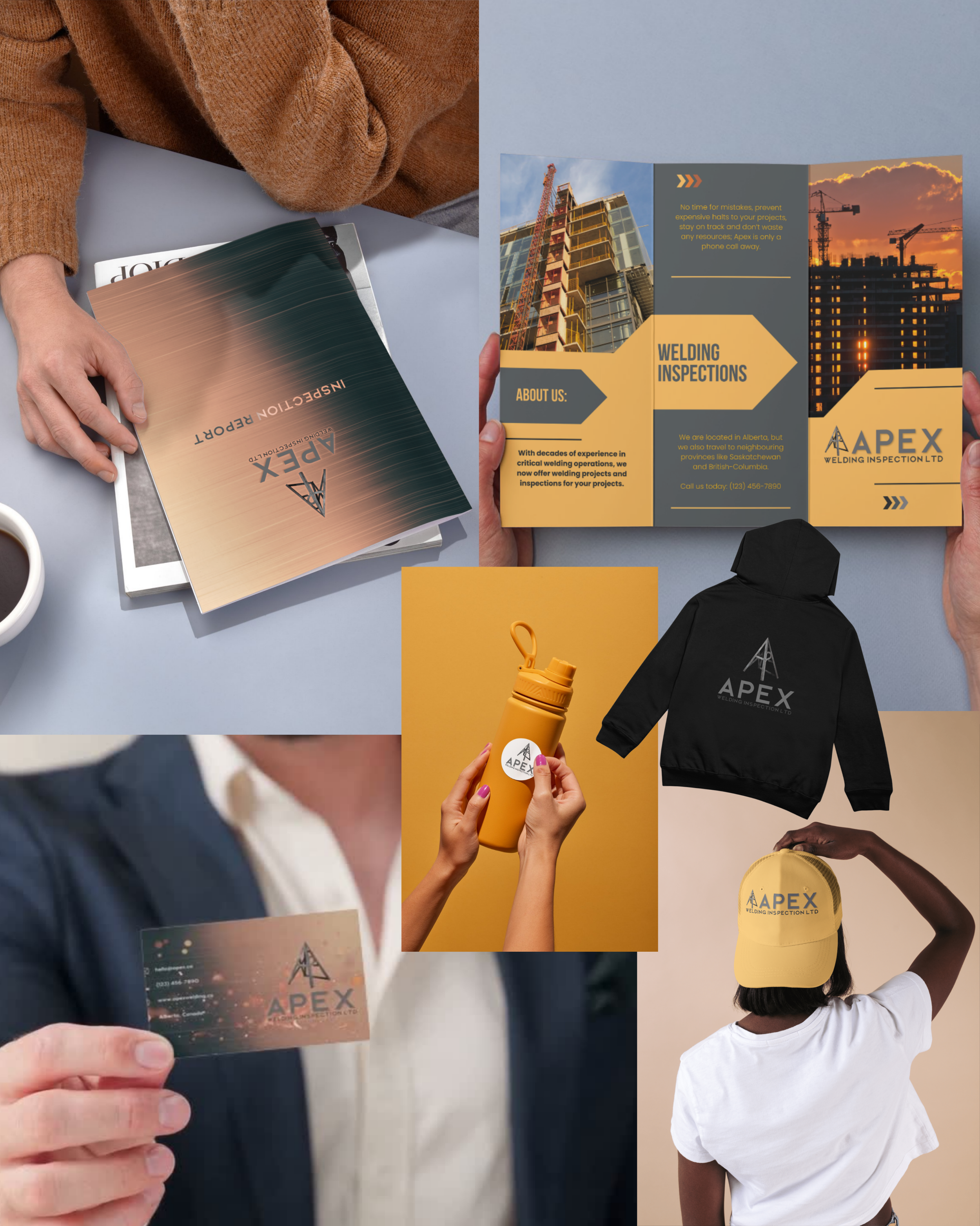
This project came from a contractor for the oil industry who had a high-performance team for critical environment work. He already had a brand done, but wanted a logo re-design that he could put on clothing, decals, stickers, hats… the typical construction swag!
I just happened to have broken my foot and was bed ridden, so this custom lettering design worked out to be a fun distraction!
This client reached out with a drawn up idea and simply needed someone to bring it to life.
Since this was one of my first project, I quickly realized how taking on “I just need a logo” projects is basically impossible. There is concept and strategy behind a logo design, and the way it is used in relation to all other brand assets is crucial for optimal impact. When you design a logo, you design a brand… just like brushing your teeth and just brushing the top teeth, it’s not complete!